Logo and Business Card Project
My name is Arena Graziano and I am a sophomore majoring in Marketing and minoring in Advertisement. I chose marketing and advertising because I love art and math and I think both of these are a good mix of the things I am passionate about. I am from Costa Rica and I chose the University of Tampa because I love the hot weather, the beach, and the rain. My favorite hobbies include going to the beach or pool, painting, listening to music, and swimming in the ocean.
I am not necessarily good at self-evaluation so for the task of thinking of four words to describe myself I asked my friends and they came up with:
1. Calm
2. Independent
3. Dedicated
4. Loyal
Out of all of these descriptions, the one that most resonated with me was “calm” because though I am someone who deals with stressful and anxious moments, remaining calm is something I am actively working on.
When I input the word “calm” into the photo generator a few photos stuck out to me. I also was inspired by the “calm” app which I use to meditate sometimes and is the main reason why my friends describe me the way they do.
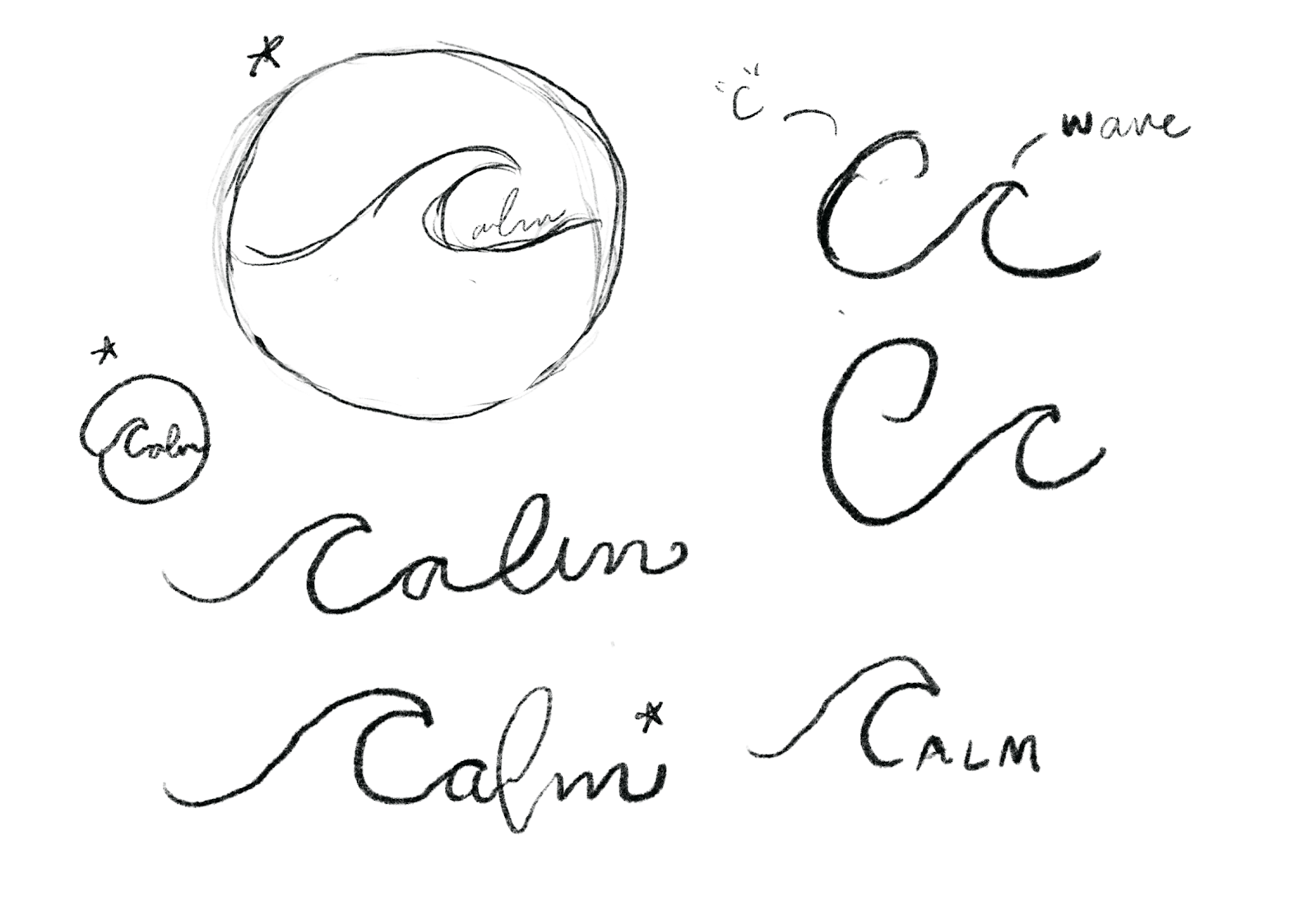
I started with these drawings and I wanted to combine the “C” with a wave. Out of all of the sketches, the three with the asteriscs were my favorite. I ended up choosing the circle because I felt it best encompassed my vision and was the most original.


Comments
Post a Comment